- Year: 2014-2015
- Country: Ukraine
- Type: document interchange (SAAS)
- Market: accounting
- Developed elements: Usecases research, UX prototypes, UI design, usability testing
Usability research
Usability research
When we started working with the system, it had already had 300,000 users. 10% of them actively used the website 4 times a year. We decided to rebuild the design of the website completely, but there was a risk that loyalty of existing customers could decrease. New innovative and user-friendly interface would have attracted attention of new users, so customer decided to take a risk.
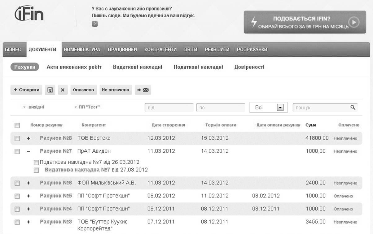
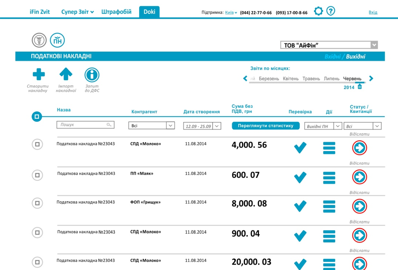
IfinoldUI
Old interface was built on the standard Bootstrap design. We detected the following problems in usability of the product:
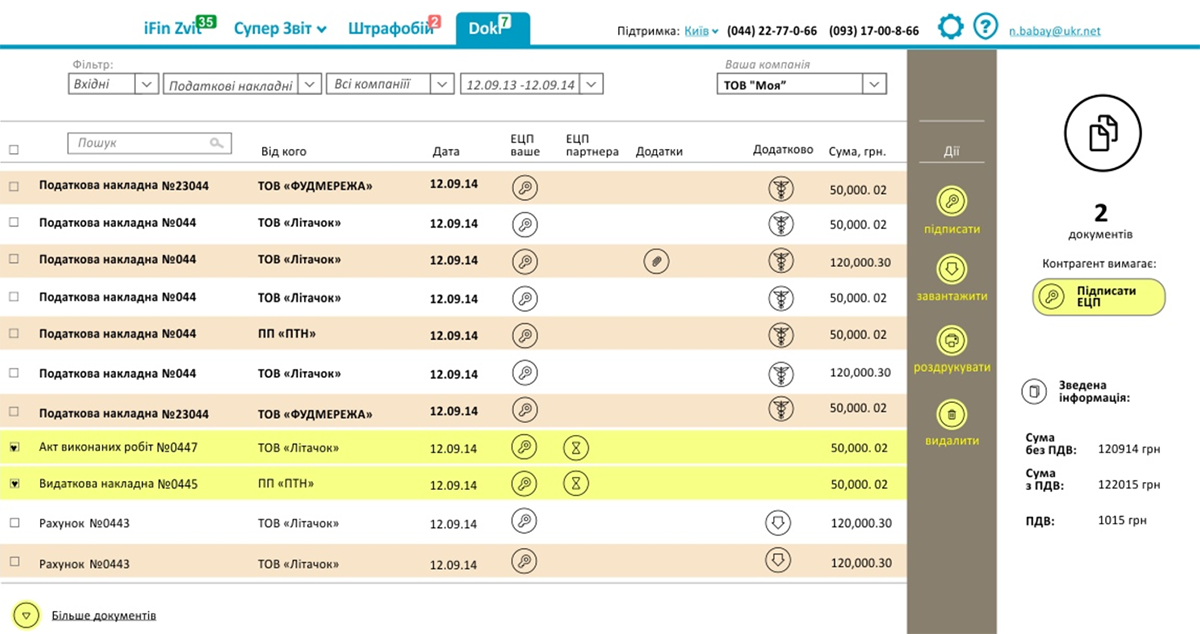
- A large amount of text information that can be replaced with icons
- Complicated navigation, including document search filters
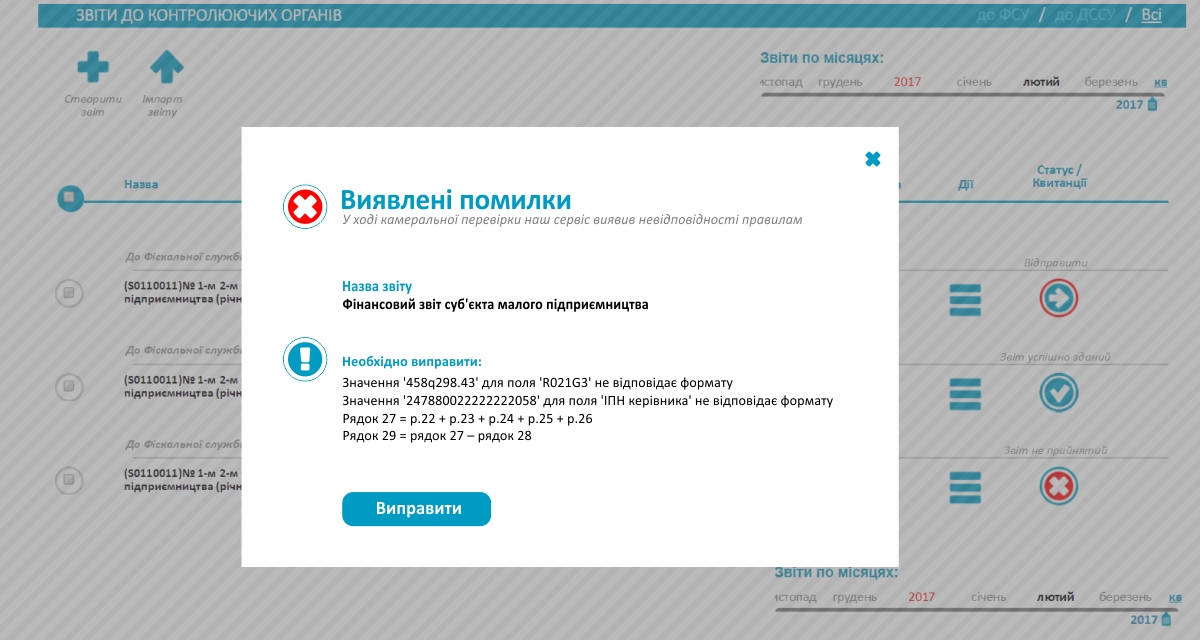
- Absence of visual markers which indicate the status of document (accepted, refused, verified, etc.)
Design variations
We've developed 2 test interface variants. To create the first one we took docusign.co.uk, drive.google.com as an example. The side panel was an important element of system management here. The second one was based on experience of using postal services.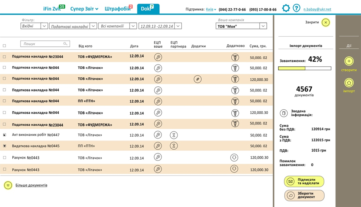
Design elements

Rebranding
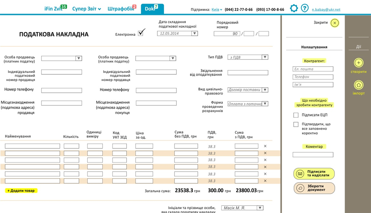
Our main objective was to make new interface simple to use. In addition, we had to add an aesthetic UI to it.
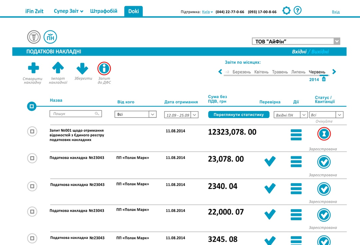
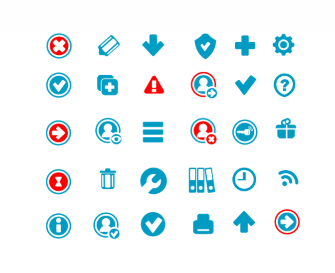
Unique icon set
We've developed a set of icons that greatly improved usability of the interface and reduced user's eye strain. We used only 2 colors (blue - neutral, red - some action is expected).
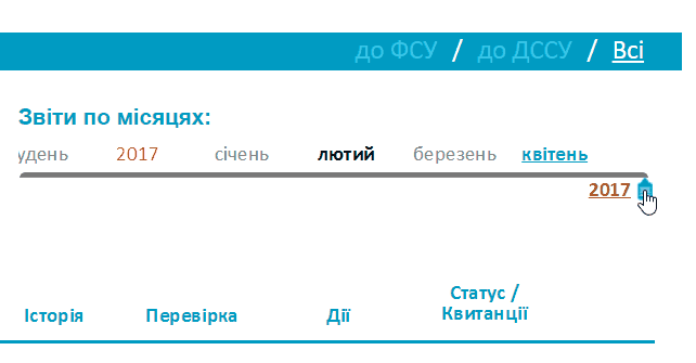
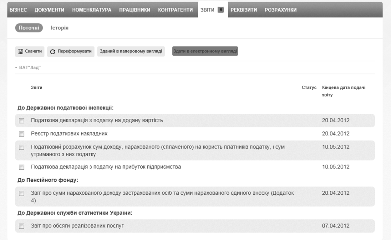
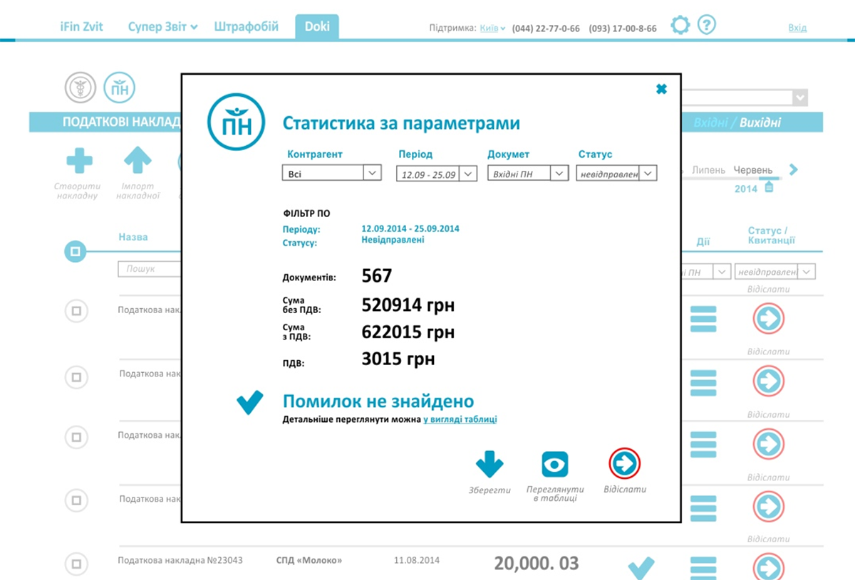
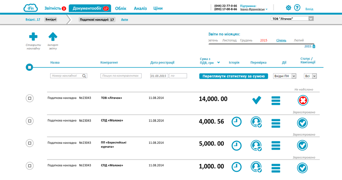
Navigation by calendar
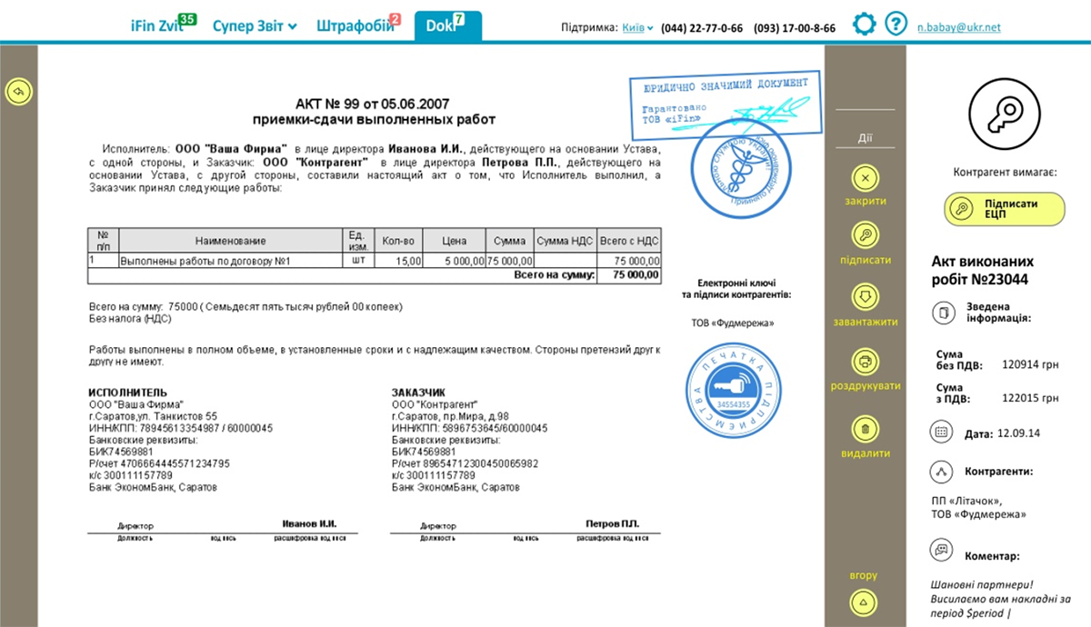
We created documents navigation by calendar instead of pages. Thanks to this function user could easily find the documents which he had previously submitted.
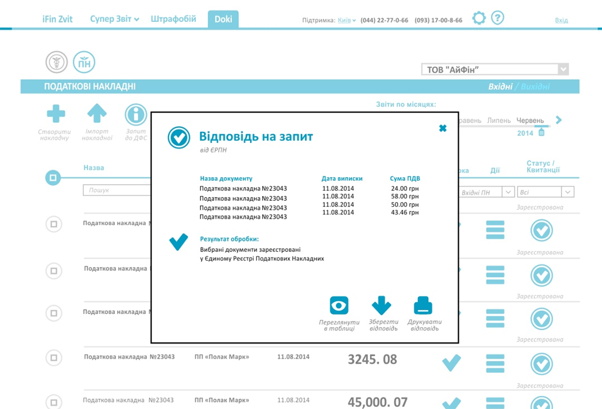
Modal windows
We maximally simplified the overall look of the interface in order not to confuse new people in accounting sphere. We hide all secondary information in modal windows.
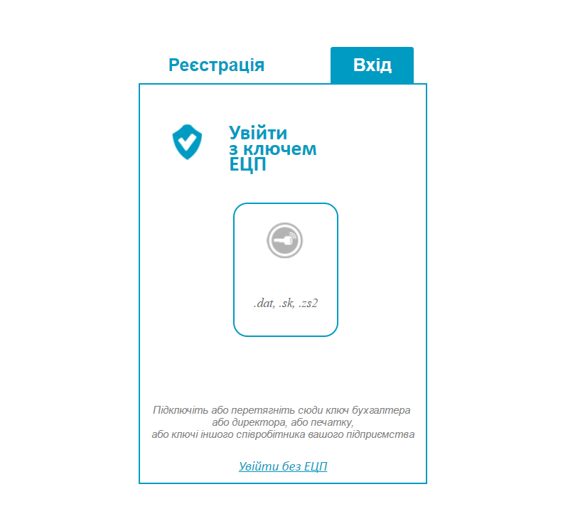
Simplified access to account
We made possible to login using electronic keys. Login process became accelerated (you don’t have to enter email and password) and it literally increased level of service security.
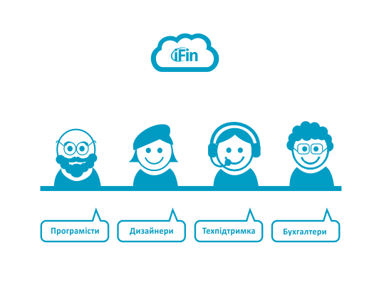
Branded ads style
We’ve developed characters that personified iFin employees for advertising purposes. They were used on online banners and printed booklets.
Development of the new functional
After we have installed the new interface of website we developed a new functionality about document interchange between contractors.
- Invoice exchange between contractors
- Subscription fee managment
- Electronic keys purchase